PROJECT OVERVIEW
I was the Lead Interaction Designer for this multimillion-dollar project which was one of the highest priority projects for Disney Parks, Experiences and Products that year. This was a major project that took one year to complete the design process.
The project's goal was to improve the overall online trip planning experience for the guests of Walt Disney World. Guest were encountering confusion navigating the many separate trip planning sections online. Because of this, a major problem arose where guests were inadvertently creating duplicate accounts for their travel party. This ultimately caused scheduling and ticketing problems when they reached the park - not the first impression Disney wanted for their guests.
CHALLENGE
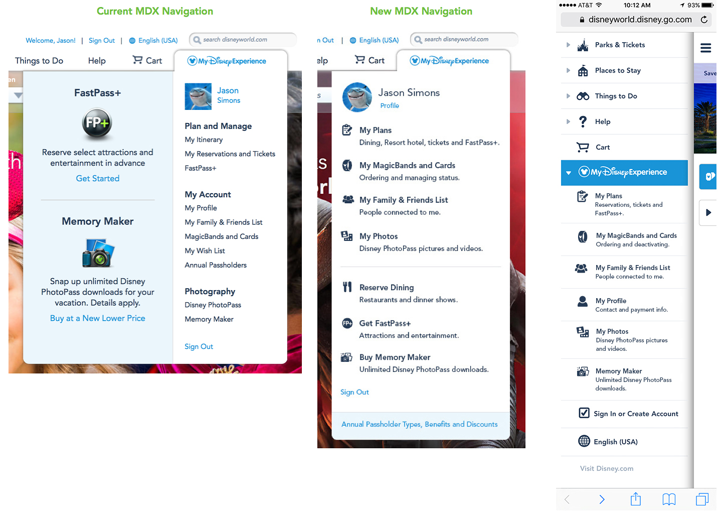
Reinvent the online trip planning process by combining all separate trip planning sections into one
• Develop a new UX and UI approach to the current Account, Reservations, and Itinerary experiences
• Help the user recognize the issue of creating duplicate accounts before they travel to Walt Disney World
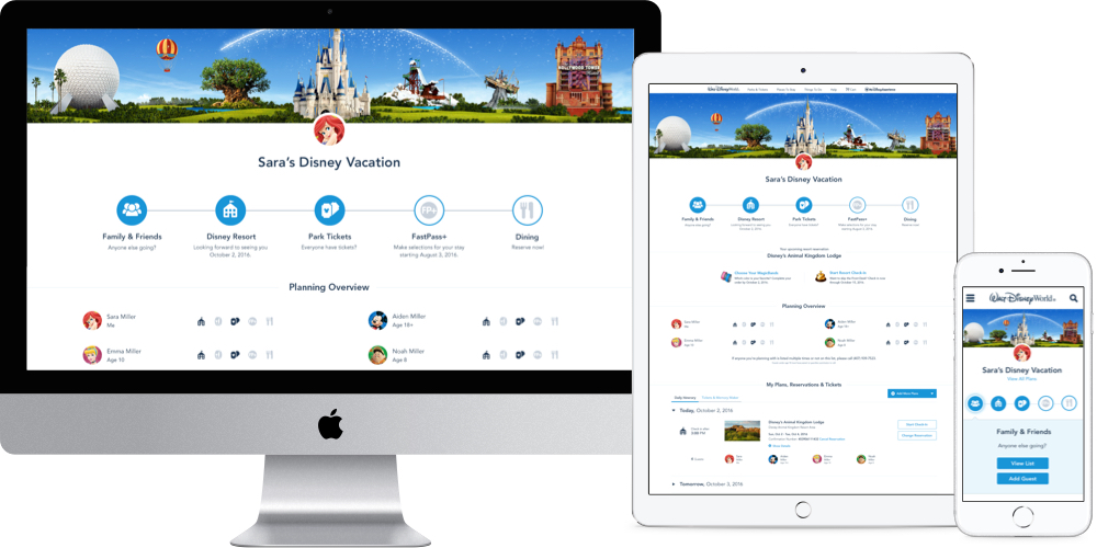
• Align the Visual Design, copy, and UX functionality across Desktop and Mobile
• Create a new visual look to tie closely to the Mobile app UI
SOLUTION
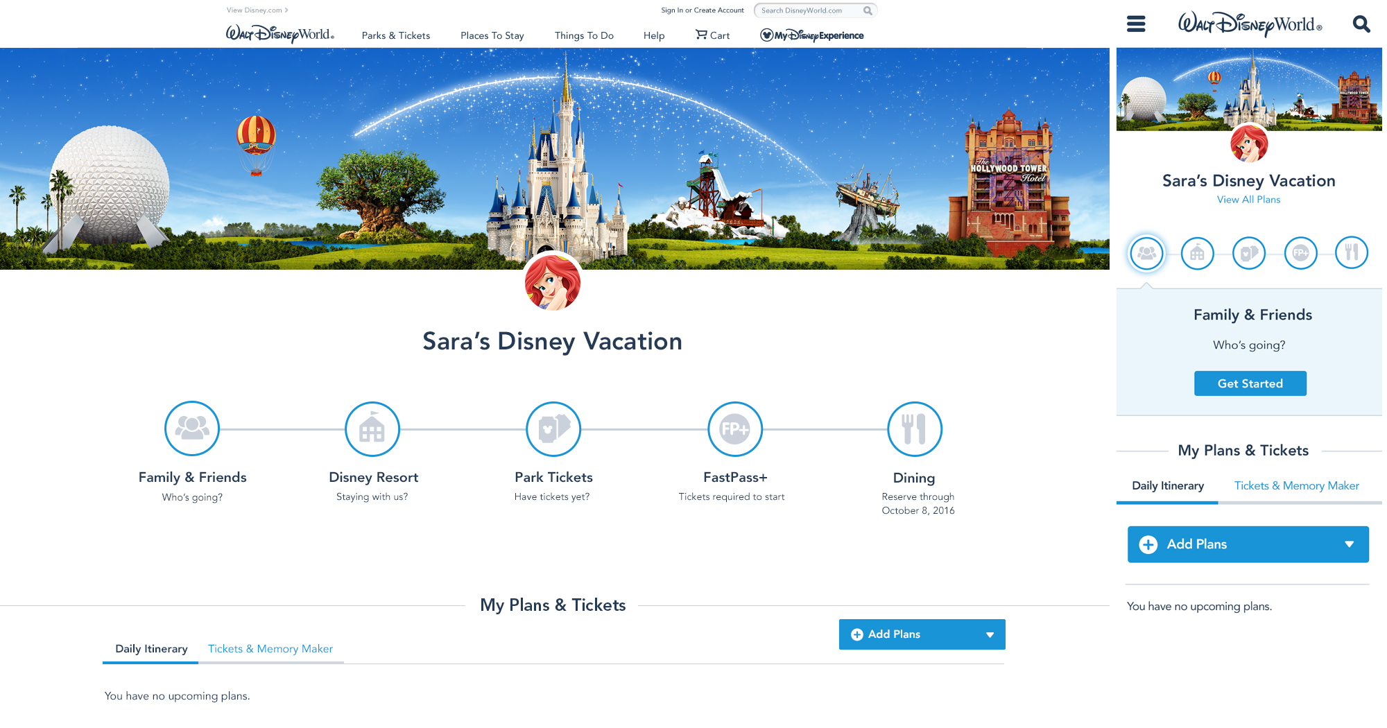
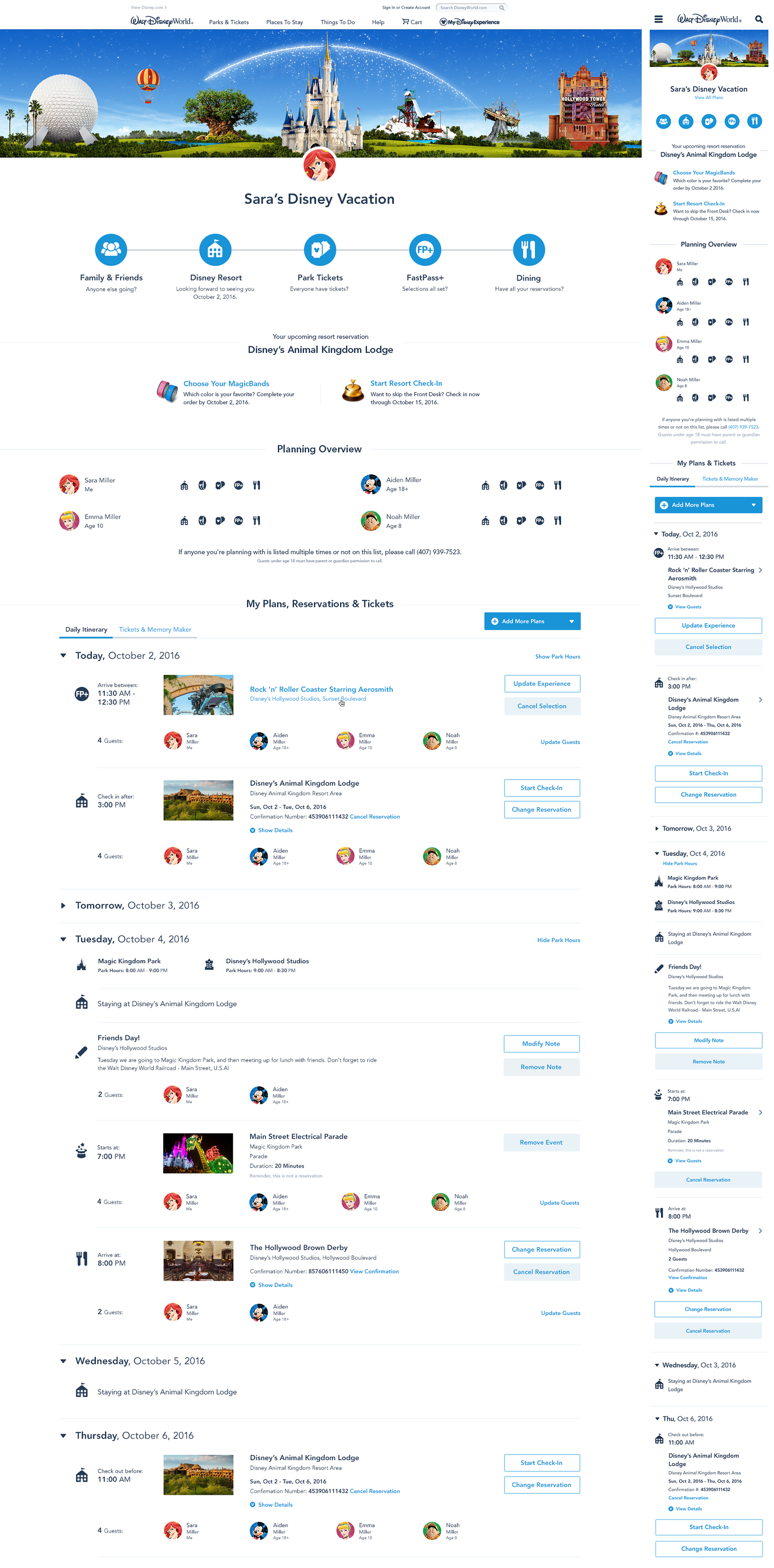
• Provided an all-inclusive dashboard that presents all trip related information in one place
• Introduced a “Hub” experience so all interactions bring user back to the home page
• Developed a better Trip Planning Tool that showed your planning progress
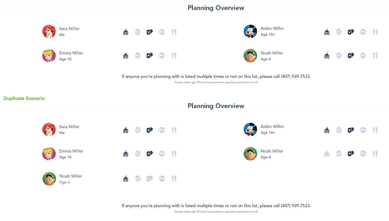
• Visual indication of guest's having duplicate accounts, planning issues, or other potential problems
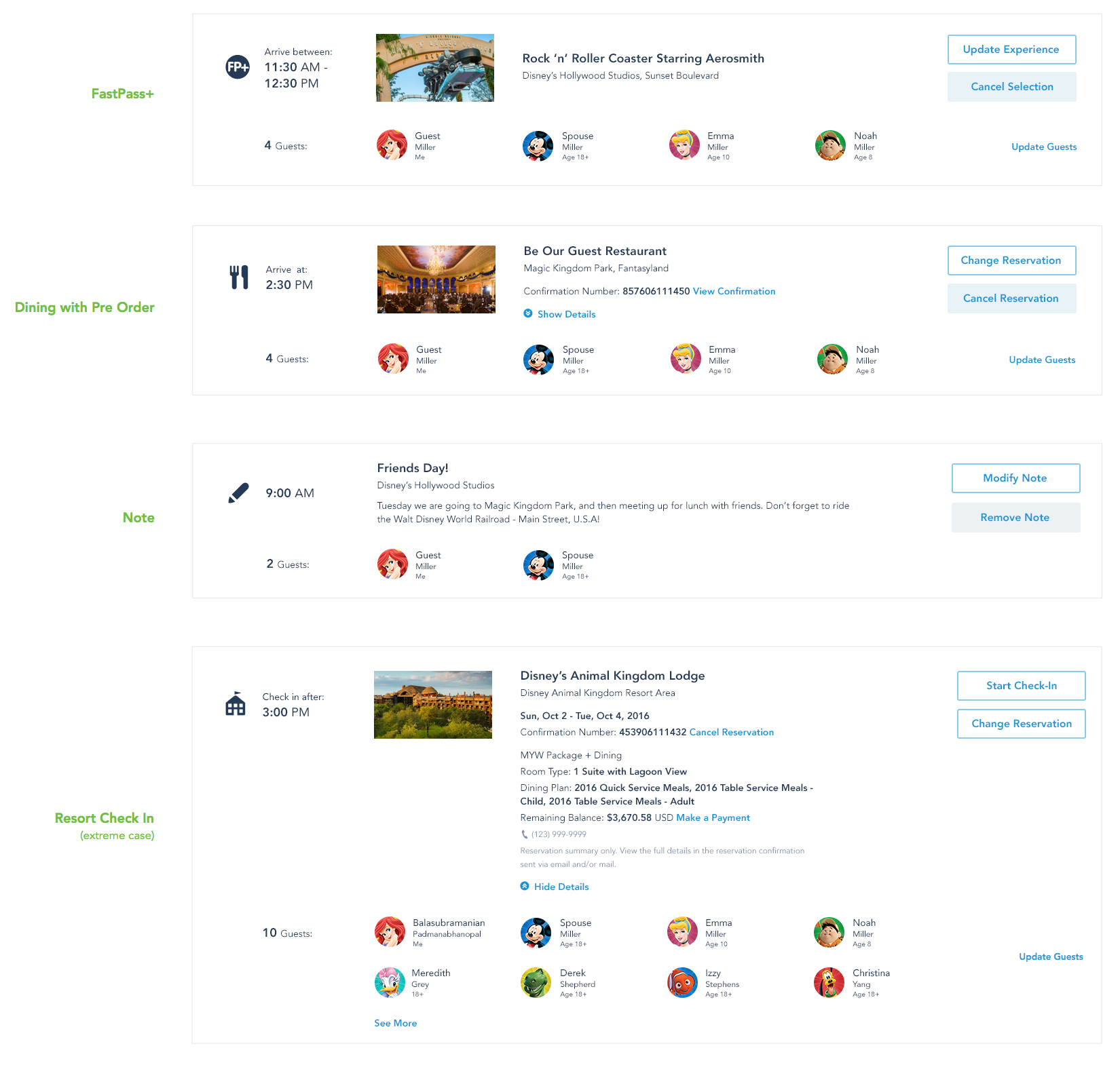
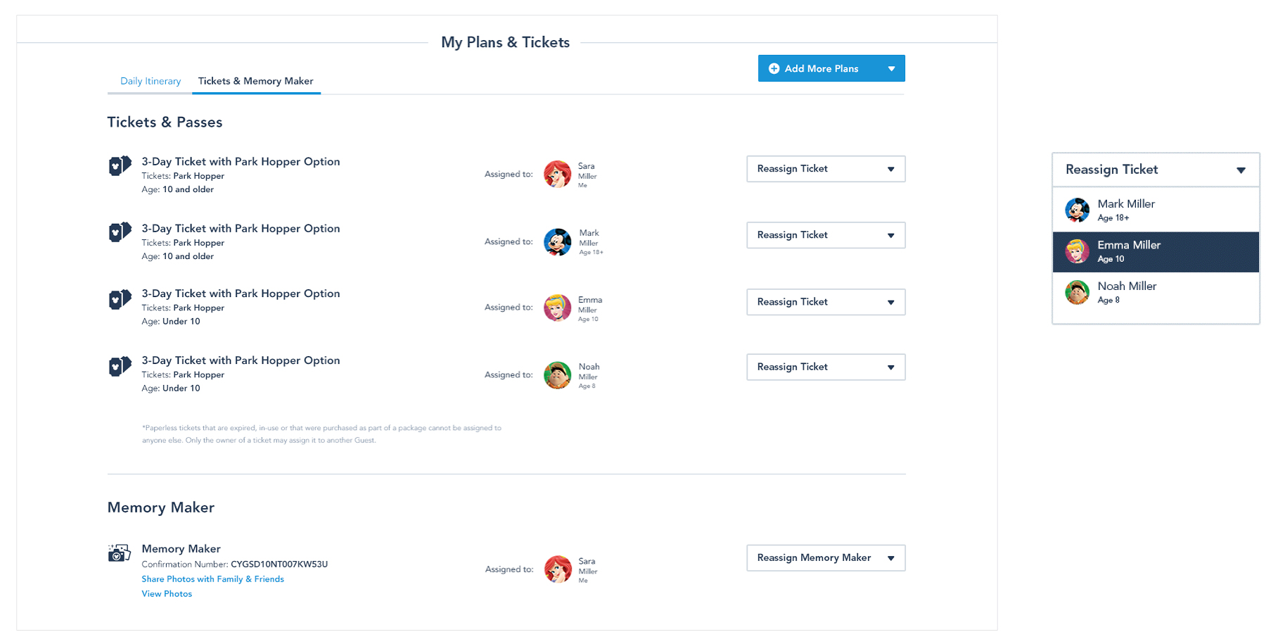
• Eliminated all redundancy within the Itinerary, Reservations and Ticketing sections
• Created a new and simplified UI for a clearer display of all information
• Aligned all functions consistently across Desktop and Mobile platforms
* After the launch of this new design, Customer Service saw a massive drop in calls around account management
Roles
Co-Lead Interaction Designer with a focus on UX and overall structure
• Lead the UX Design for the entire project, from concept to completion, across Desktop and Mobile Web platforms
• Presented and defended design concepts to Executive VPs and Design leadership
• Worked with usability researchers in the development of an in-depth user test at Walt Disney World
• Assigned and oversaw work of other designers
Interaction Design | UX/UI Design | IA | Wireframes | User Flows | User Testing
Platforms
Mobile App | Mobile Web | Desktop Mac & PC
Years
2015 - 2016
PROJECT OVERVIEW
Trip planning sections were disjointed and separate without consistent copy or functionality
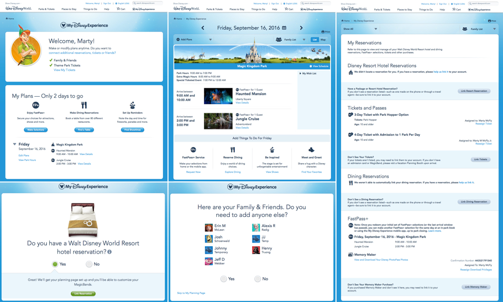
RESEARCH & CONCEPTS
Organization of the various sections was a key factor in making sure the user wasn't overloaded with information.
Issues we were trying to address were:
• How will this interact with Account settings?
• How to combine these separate sections?
• Could this actually work as a 1 page / Hub experience?
• Can the UI be simplified?
• Will Engineering accept this functionality?
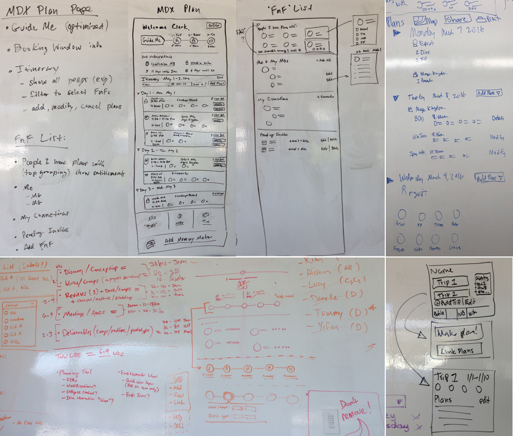
I designed many concepts to find the best way to combine all of the information and provide the best user experience.
Issues I considered were:
• Desktop and Mobile Web platforms would be aligned
• The Travel Party, Duplicate Accounts, Itinerary, and Ticket Assignment sections had to be clear and organized for the user
• Introduced a planning status indicator to further help the user

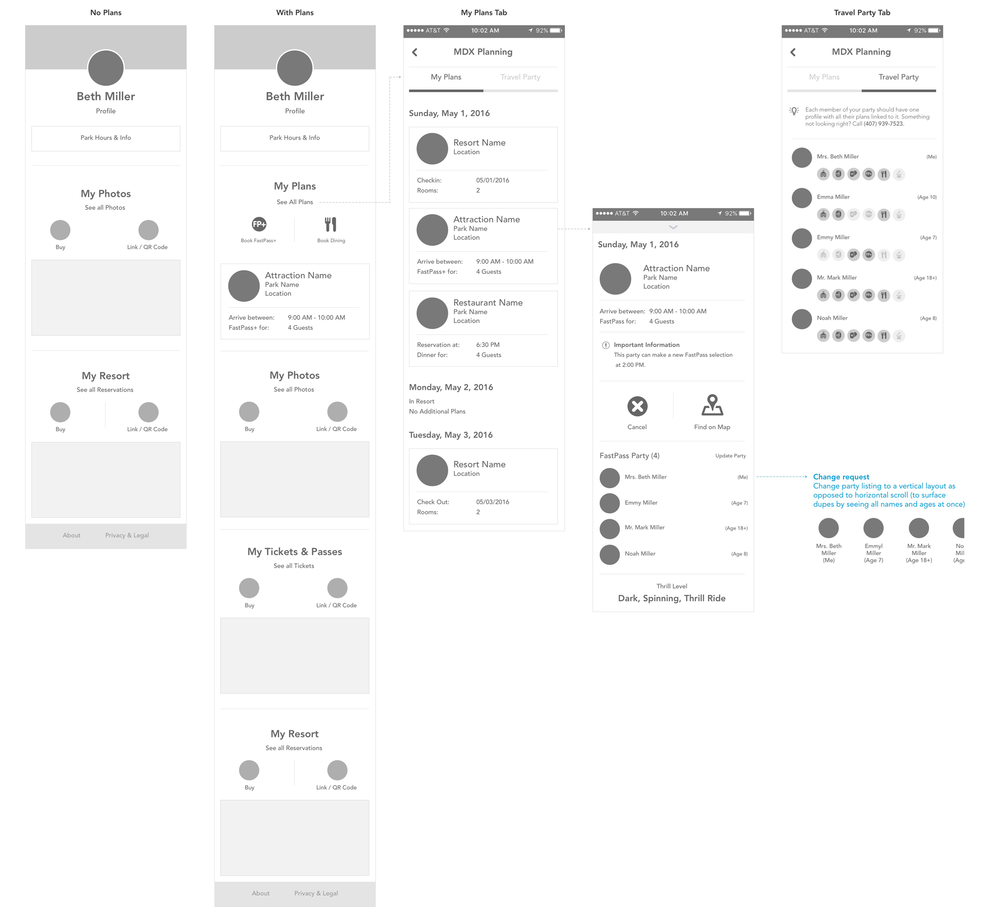
The overall concept came together as I started to finalize a layout. Approval of this layout was based on:
• Exploring all possible user flows and conditionals to make sure this would be functional
• Engineering approved the functionality and layout
* This was a major and complicated effort for the development team due to a lot of legacy code
• Executive VPs and Design leadership approved the new direction
The overall concept came together as I finalized the layout. This was now ready to be user tested.

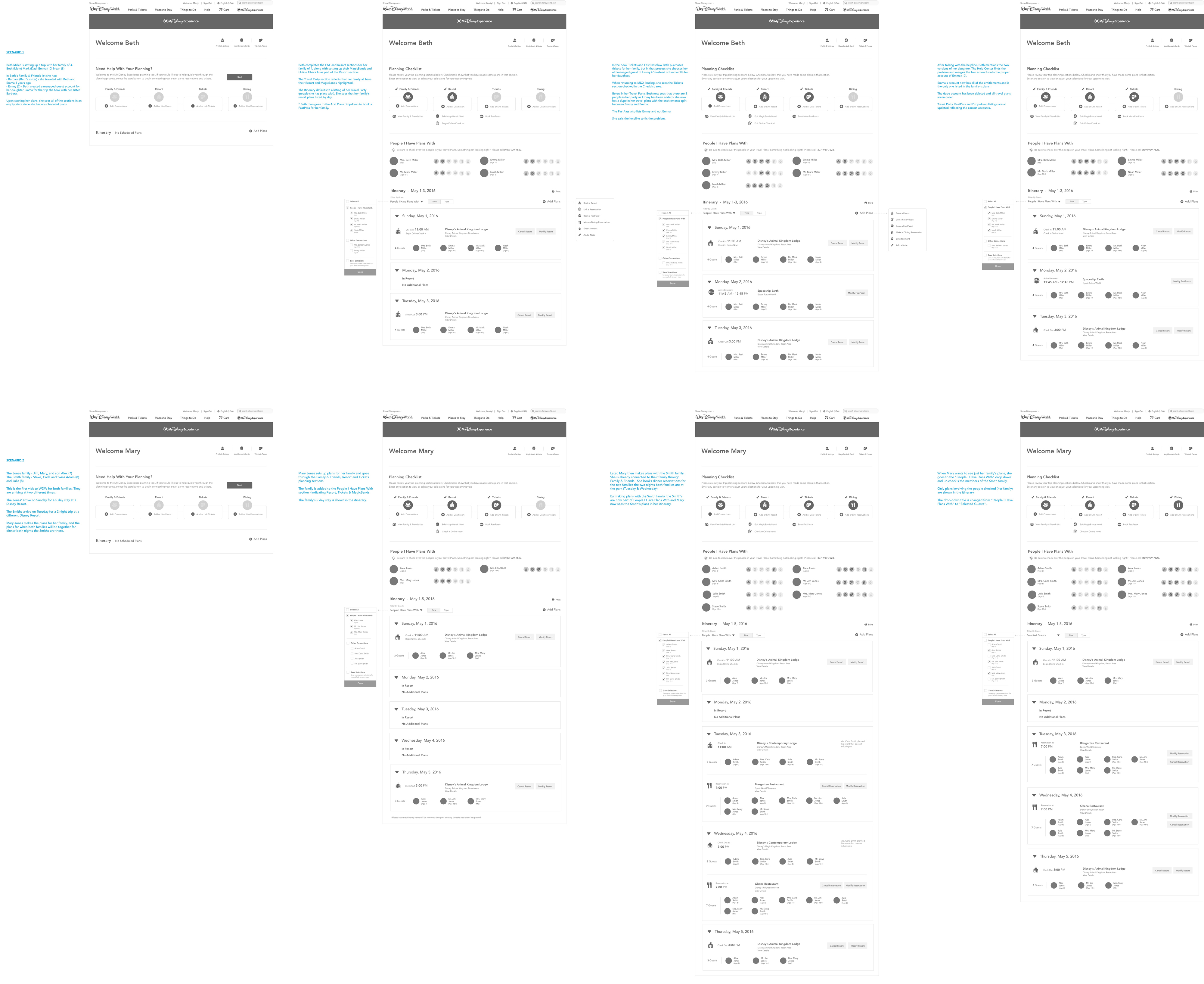
USER TESTING
Images and color were added to the final wireframes to create high-fidelity mocks for testing.
I worked with UX researchers in creating tasks, questions, and all screen scenarios for the in-person tests.
Test Results
The tests were successful with very positive feedback. All features and functionality were easily understood, and the main issue of duplicate accounts was clearly identified by the users. This was a great result.
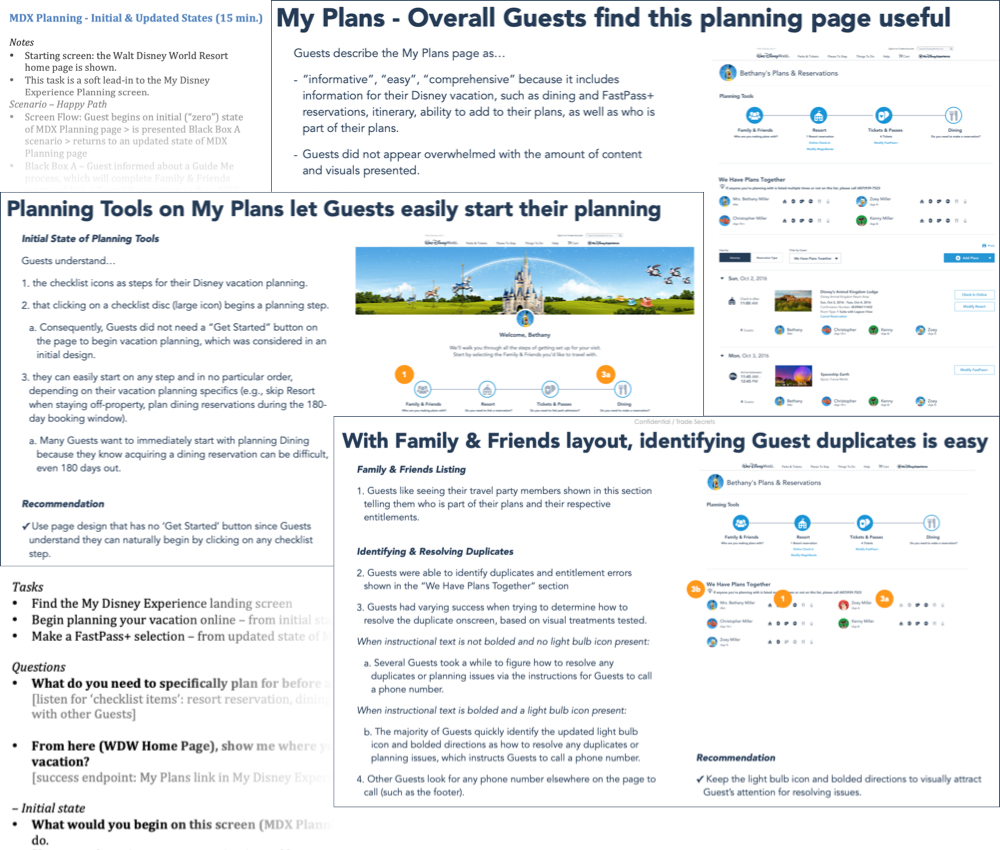
FINAL DESIGN
The final layout was designed into three distinct sections for the user:
Planning Tool - Status indicator that included 5 core items for the user to build a successful vacation. This would highlight planning milestones, suggestions, and next steps the user should take in their planning.
Planning Overview - Auto-grouped automatically once plans are made, this shows who is in the travel party and what entitlements are assigned to each individual of the party.
Itinerary & Tickets - This section consolidated three separate sections into a single section. It serves as the start and end point to planning providing a Hub experience.
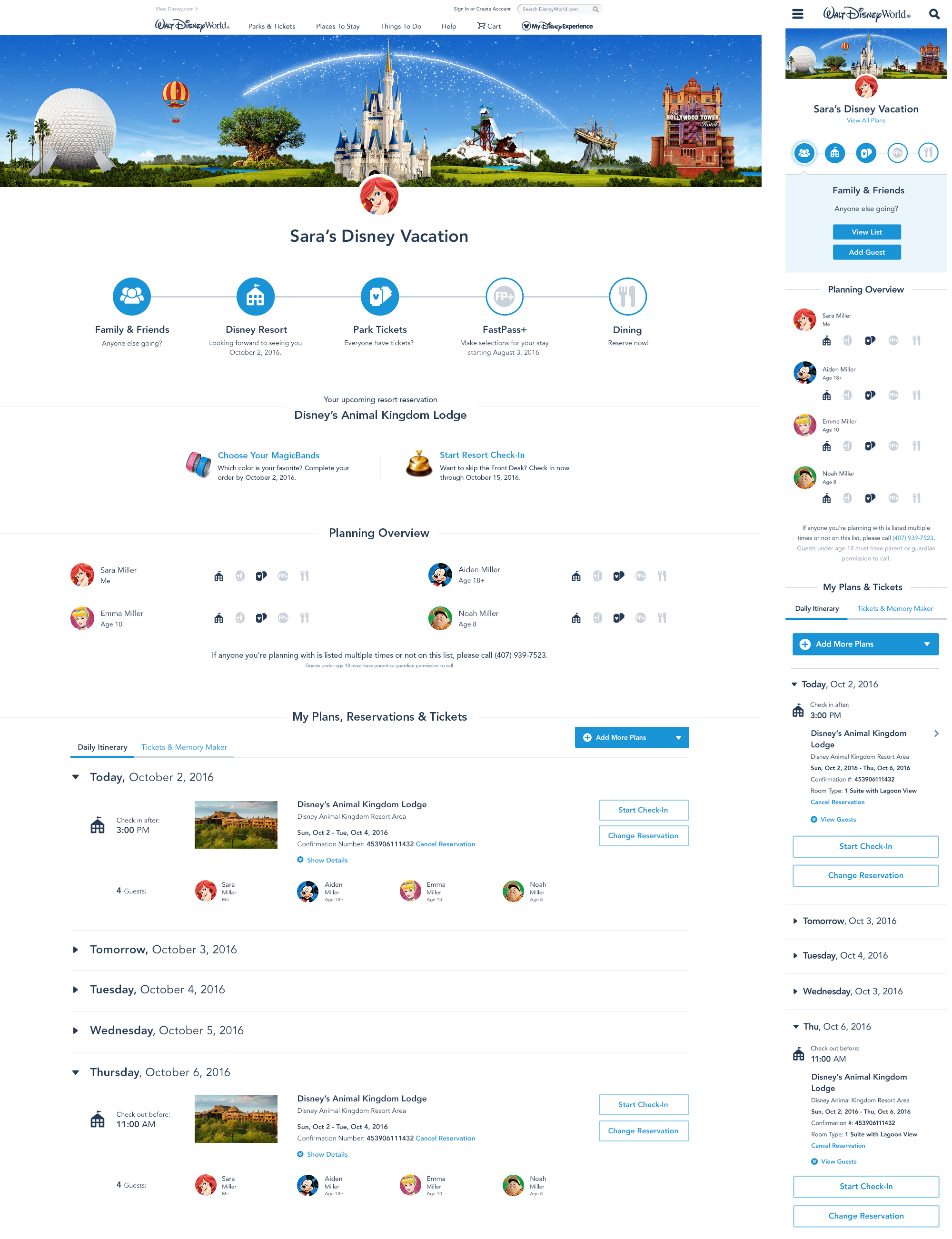
When the user opened this page, blue circles would dynamically fill in showing the progress they have made in their planning - this would reinforce to the user the need to complete all sections.